one thing i’ve always strove for is complete transparency. all the cards out on the table. leveling the playing field. clients making informed decisions. no surprises.
another thing that’s been clear from the get is part of what sets me — now us — apart is the company we keep. i’ve always worked with a certain type of client. why? great clients inspire great service. not exactly a secret, i don’t think.
now, when i go back and read the prescient copy on the scoot-a-que 10 gift card i have to chuckle.
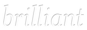
and because treefort are conceptual thinkers and ‘get’ me plus all this, they say how about white-on-white — something transparent, almost — that’ll recede into the background on the website and make full-color pics of clients real prominent right in front. because this is about them, right, not you?
indeed.
keep the period or no?


January 4, 2008 at 1:23 pm |
period = yes.
Keep up the good work 🙂 You’re on to something…
January 4, 2008 at 3:01 pm |
good feedback about this in my inbox. i’ll add that, in jen’s words, the above is just one of ‘a few quick samples.’